What iOS 26 can teach about LegalTech UX design
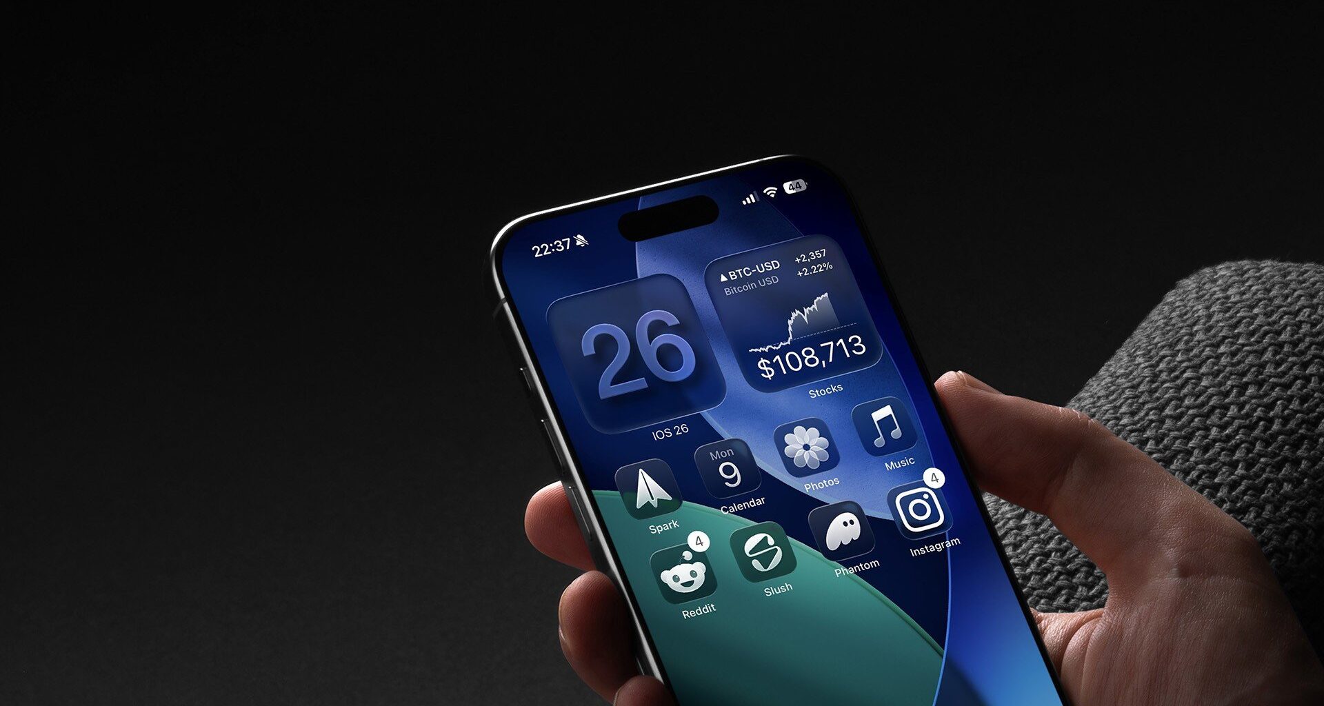
When Apple released iOS 26, they put the new “liquid glass” interface front and centre. It wasn’t just a design refresh, it was marketed as a new paradigm

When Apple’s iOS 26 Design Misses the Mark
When Apple released iOS 26, they put the new “liquid glass” interface front and centre. It wasn’t just a design refresh, it was marketed as a new paradigm - a glossy, translucent layer meant to unify the look and feel of Apple’s entire ecosystem. The promise was that your phone, your Mac, even your Vision Pro headset would all share the same sense of depth and coherence. This wasn’t about small improvements to legibility or navigation. It was a statement of intent about the future of Apple’s ecosystem, a move towards blending devices, platforms, and even the metaverse into one seamless experience.
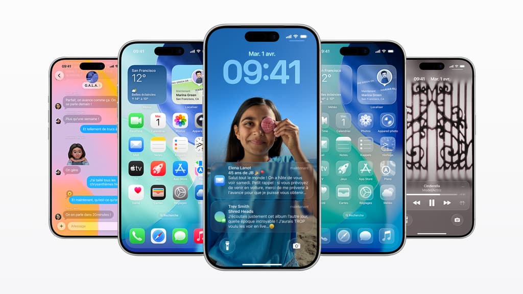
The reviews, however, told a different story. Tech journalists admired the ambition but flagged the trade-offs almost immediately. Users on forums described the look as distracting, hard to read, and in some cases even dizzying. Accessibility communities pointed out that the transparency effects reduced contrast and made everyday tasks more difficult. People began posting screenshots and tutorials on how to switch the feature off or tone it down. The design was supposed to “bring focus” and “joy” - Apple’s words, not mine - but for many, it did the opposite.
I was one of them. The first day after upgrading, my phone felt like a pane of glass laid on top of another pane of glass. Everything blurred into everything else, and simple actions like checking a message or opening my calendar suddenly required more effort. After a few hours of frustration, I found myself in Accessibility settings adjusting sliders and switching off transparency. Instantly, the phone became usable again. It was still iOS 26, but it felt familiar, practical, and most importantly, clear. What struck me wasn’t just the personal relief - it was realising that so many others had done exactly the same thing. I wasn’t a lone voice; this was a collective reaction.
What iOS 26 Teaches Us About Legal Software
For me, that story is more than a gripe about phone design. It illustrates something I see every week when I talk to in-house legal teams. The story of liquid glass is the story of how many contract lifecycle management systems are built and sold. CLM providers often pitch their products as ecosystems - end-to-end platforms that will connect every legal process in one sweeping interface. On paper, it looks compelling. In a demo, it feels powerful. But when lawyers and business users sit down to use it, the complexity gets in the way. Screens are busy. Workflows are heavy. Everyday tasks feel harder than they should be.
It’s not that these platforms have no value. Just like Apple’s design, they are technically impressive. The problem is that in the pursuit of an ecosystem play, the average user journey gets lost. The core questions - Can a salesperson quickly generate an NDA? Can procurement see where a contract is stuck? Can legal find a clause in under a minute? - don’t get the attention they deserve. And because many CLMs are designed by non-lawyers, the practical day-to-day experience of in-house teams is often an afterthought.
The result is predictable. Teams spend months on implementation, only to use the system as a glorified document repository. Advanced features sit idle, turned off, or ignored. Just as iPhone users reduce transparency to make their phones usable, lawyers switch off half the modules to make their CLM manageable. Adoption falls, value is underdelivered, and enthusiasm fades.
This isn’t to criticise any one vendor. The ambition behind many CLM systems is genuine, and the complexity is usually well-intentioned. But it highlights a recurring issue in enterprise software: features are added for the sake of breadth, integrations are promised to satisfy procurement checklists, and before long the product is impressive in scope but fragile in practice.
Building Legal Software That Just Works
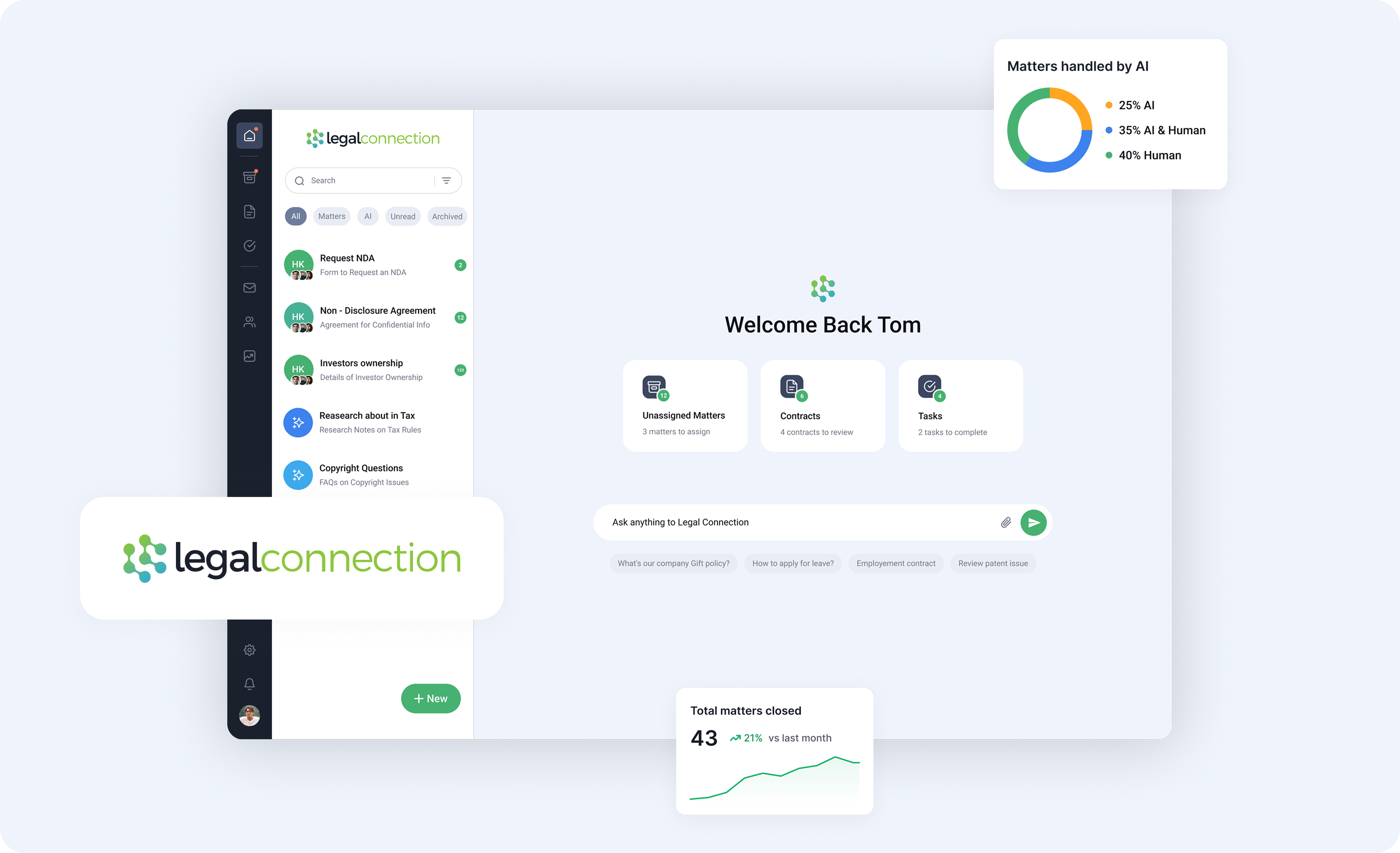
At Legal Connection, we’ve tried to avoid this trap by grounding everything in how people actually use the product. One of the most valuable things we do is sit with teams during our free trials and watch how they interact with the software. We ask them to upload their own contract templates, their own playbooks, and then run a real request through the system. Nothing reveals strengths and weaknesses faster than a lawyer trying to send out an NDA in the middle of a busy afternoon. These sessions aren’t polished demos. They’re reality checks, and they’re indispensable.
The benefit of this approach is twofold. First, users see immediately whether the product fits their needs, without pressure or guesswork. They don’t feel like they are buying something they don’t need. Second, we learn from the way people naturally behave. Do they hesitate before clicking? Do they get lost in a menu? Do they understand the status of a contract at a glance? Every small hesitation is a clue, and fixing those clues is how you build software that feels effortless.
There is, of course, a tension here. Some users want advanced features - granular permissions, deep integrations, complex approval flows. Others just want to get from draft to signature without thinking about the system at all. Building CLM means constantly balancing power with simplicity. It’s tempting to add every feature requested, but too much weight and the product buckles. The harder task, but the better one, is to keep the core experience simple enough that an average user can figure it out unaided, while still offering depth for those who need it.
That is why I’m glad we’ve always taken a user-centric approach at Legal Connection. The best feedback we get is the simplest: “It just works.” That line used to be synonymous with Apple, and for good reason. Good technology should stay out of the way and let you focus on the task, not the tool.
And for all my complaints about iOS 26, I’m not going to give up my iPhone any time soon. The device is still brilliant, even if I had to switch off some gloss to make it usable. The lesson for LegalTech - and for us as builders - is not that ambition is bad, but that ambition should never come at the expense of clarity. If you need a manual, or worse, an implementation partner just to use the basics, the defaults are wrong.
At Legal Connection, our aim is to set those defaults right. You can try it for yourself. In just one onboarding session you’ll see how intuitive workflows, AI-assisted triage, and a usable contract repository can make legal work feel lighter. No gloss required.